Design for Others
Fox Theatre website redesign for children aged 12–16
Introduction
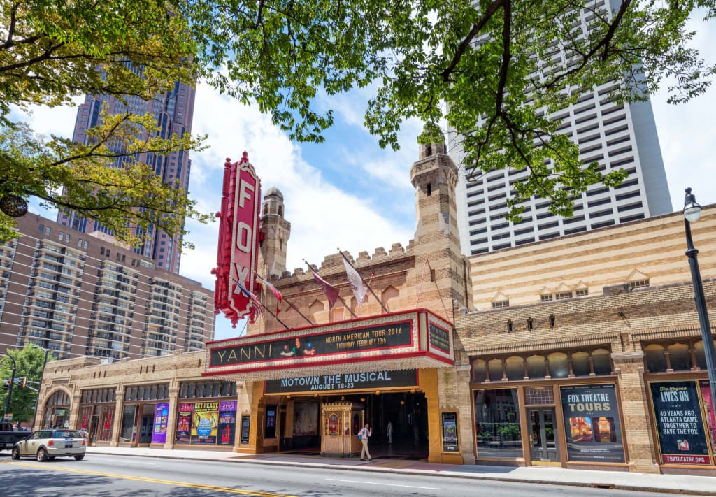
As one of Atlanta’s premier venues for live entertainments, Fox Theatre hosts more than 150 performances a year, including Broadway, movies, rock music, and comedy. Besides, the theatre also allows customers to rent avenues for any occasion ranging from private parties to wedding ceremonies to corporate events.
For this group project, the goal of our group is to redesign the mobile website of Fox Theatre for the target user group of children aged 12–16. Since one of the most important functions of the fox website is purchasing event tickets, we choose 5 screens, namely Homepage, Upcoming Events, Even Info, Booking and Checkout, to reproduce the ticket buying process.
Information Design
The first step of the design is to find the needs of our target user group. Due to the limited time and resources, we could not interview our target group. Hence, we created 4 different personas to help us brainstorm what the real needs of our users are. For each persona, we ask ourselves 3 questions: 1) Who is the user? 2) Why does the user go to the Fox Theatre? 3) When will the user do on the website? Moreover, considering that the age group from 12–16 always hang out with friends or attend school activities, we added group size information into our assumptions.

Furthermore, after carefully examining the current desktop website of Fox Theatre, we found some major issues that need to be modified (see the picture below).

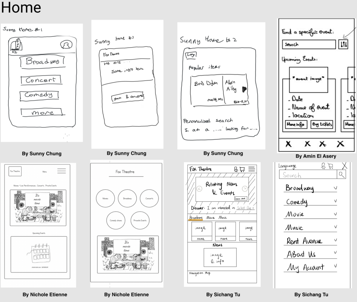
Based on the persona we created and the key ideas after discussion, we started to sketch each screen.
Homepage
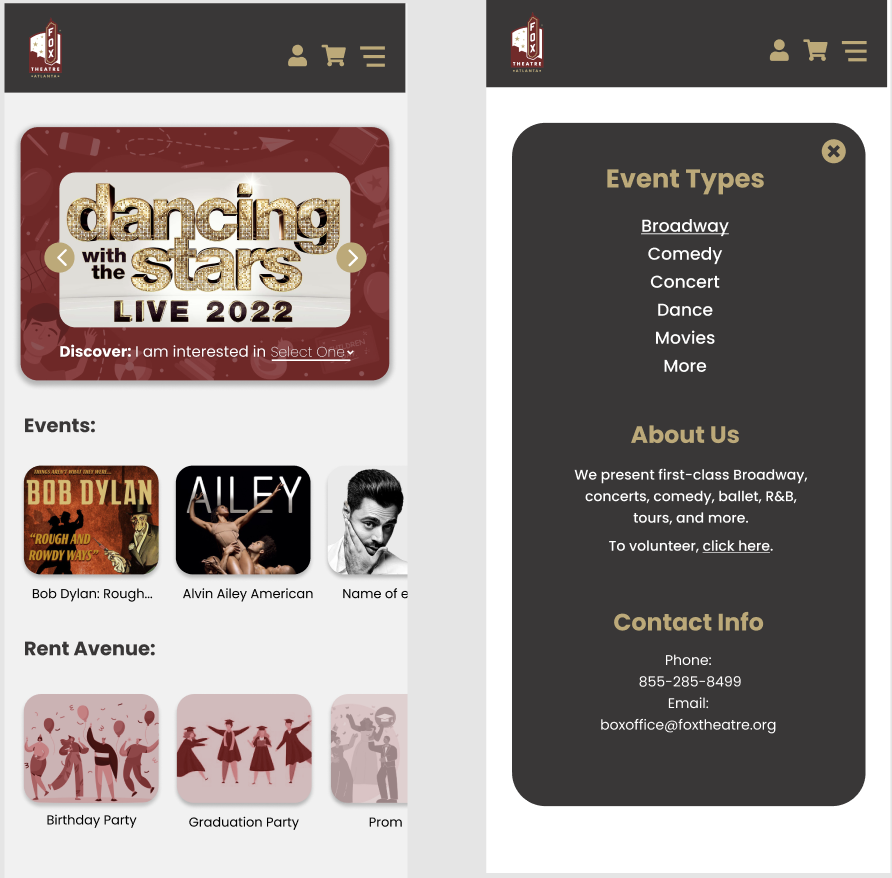
A good Homepage design would set a great first impression for the website. The information presented on the original website homepage is unclear and the navigation bar is confusing. It would take a while for the first-time user to figure out what Fox Theatre is and what events they provide. Hence, in order to better cater for our target user group, we would like to keep the design simple and useful. We decided to:
- Reorganize the event categories;
- Provide more concise and clear ‘About us’ information;
- Delete unimportant sections from the homepage.
Upcoming Events Page
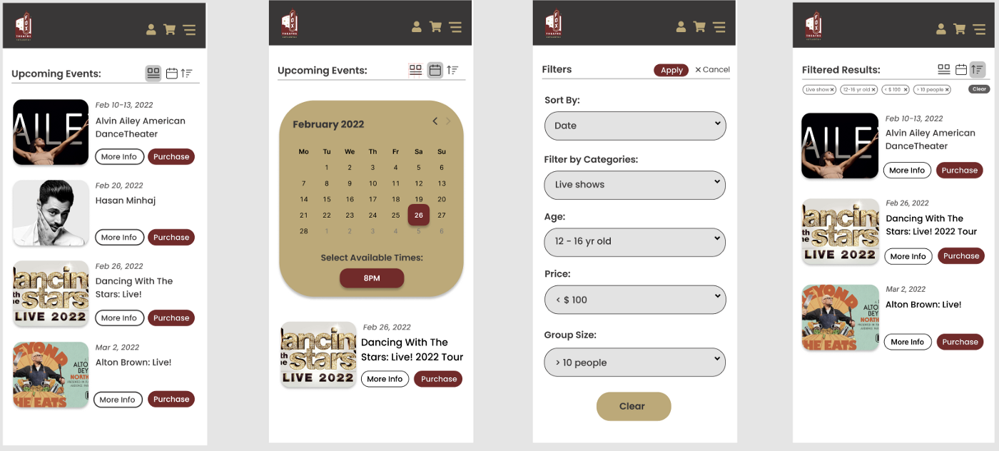
As for the Upcoming Events page, we assume that users will be directed to this page after they click on the ‘Events’ category on the Homepage. This page list all available events in the theatre. The original website only provides the list view and grid view for this page. So, we would like to add a sorting function that enables the user to filter the events and a calendar view that allow the user to check events on a specific date and time.
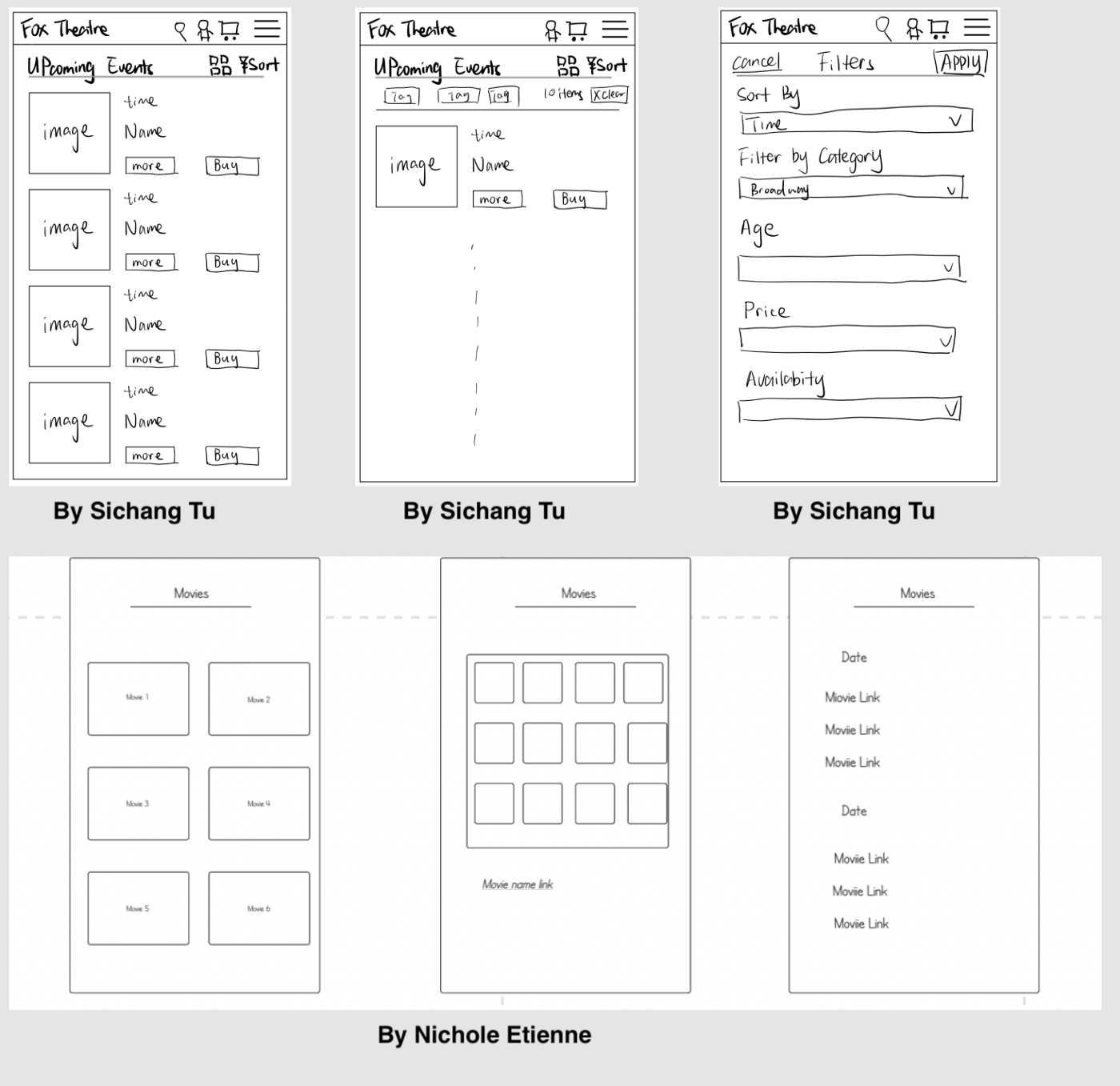
Event Info Page
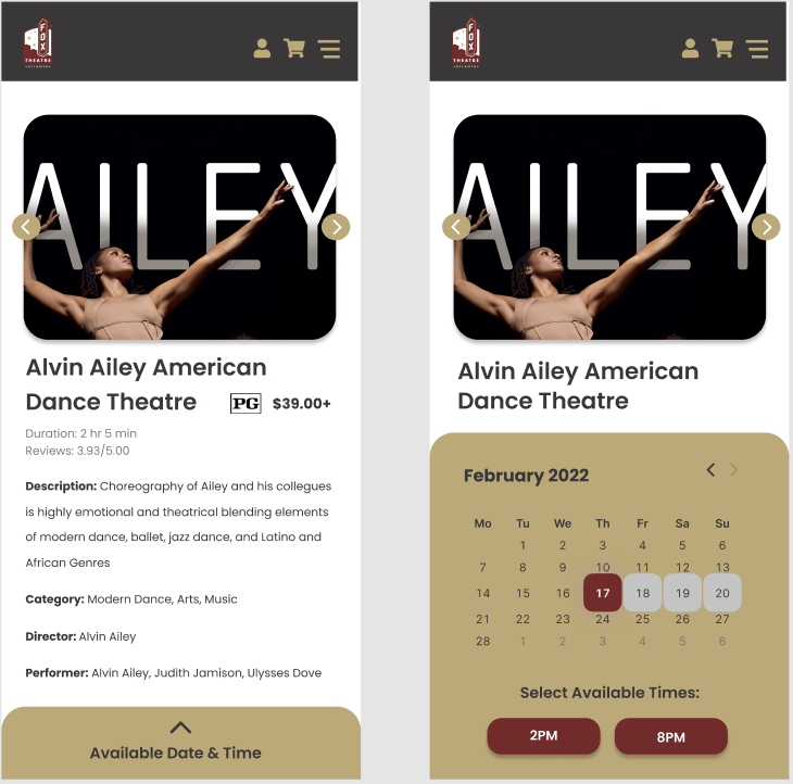
Event Info page presents the detailed information of a specific event. On this page, we assume that users can obtain information such as event name, date & time, price, movie picture content rating system, duration, date & time, cast, etc.

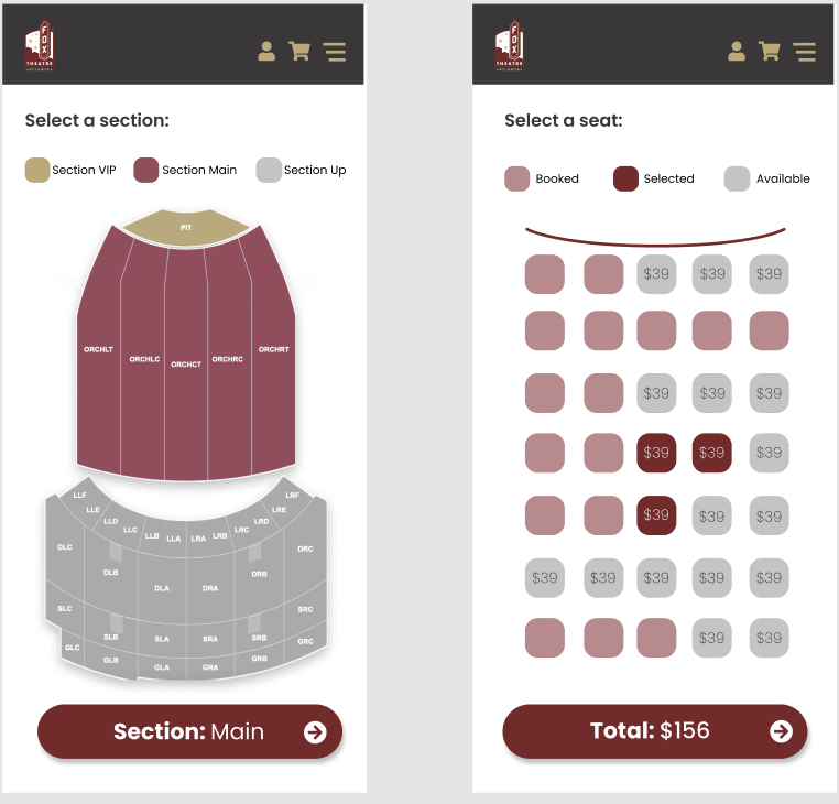
Booking Page
After checking the event information, the next step is to select the seat. We assume that it would be easier and more straightforward for our target group to choose seats on the seat map.
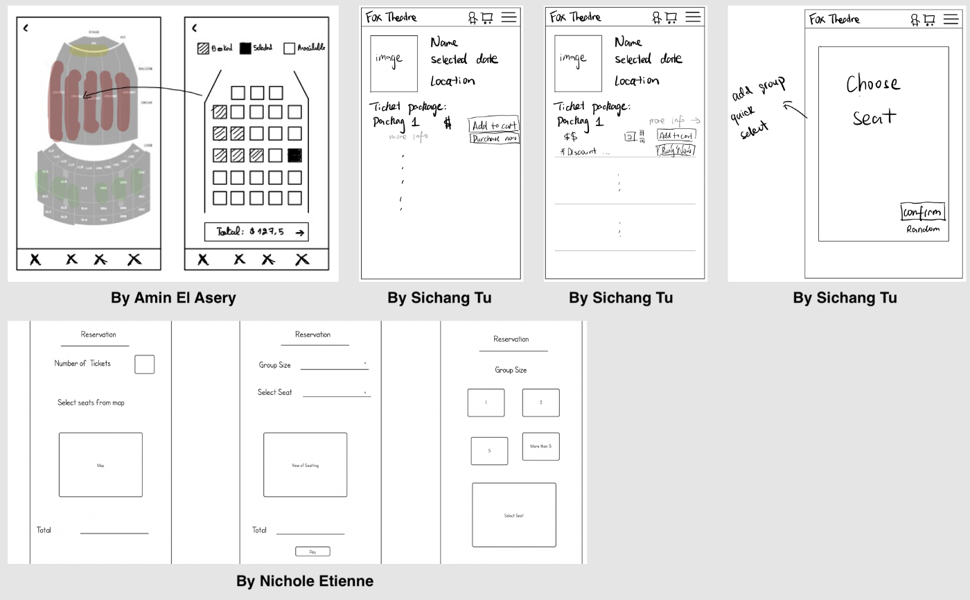
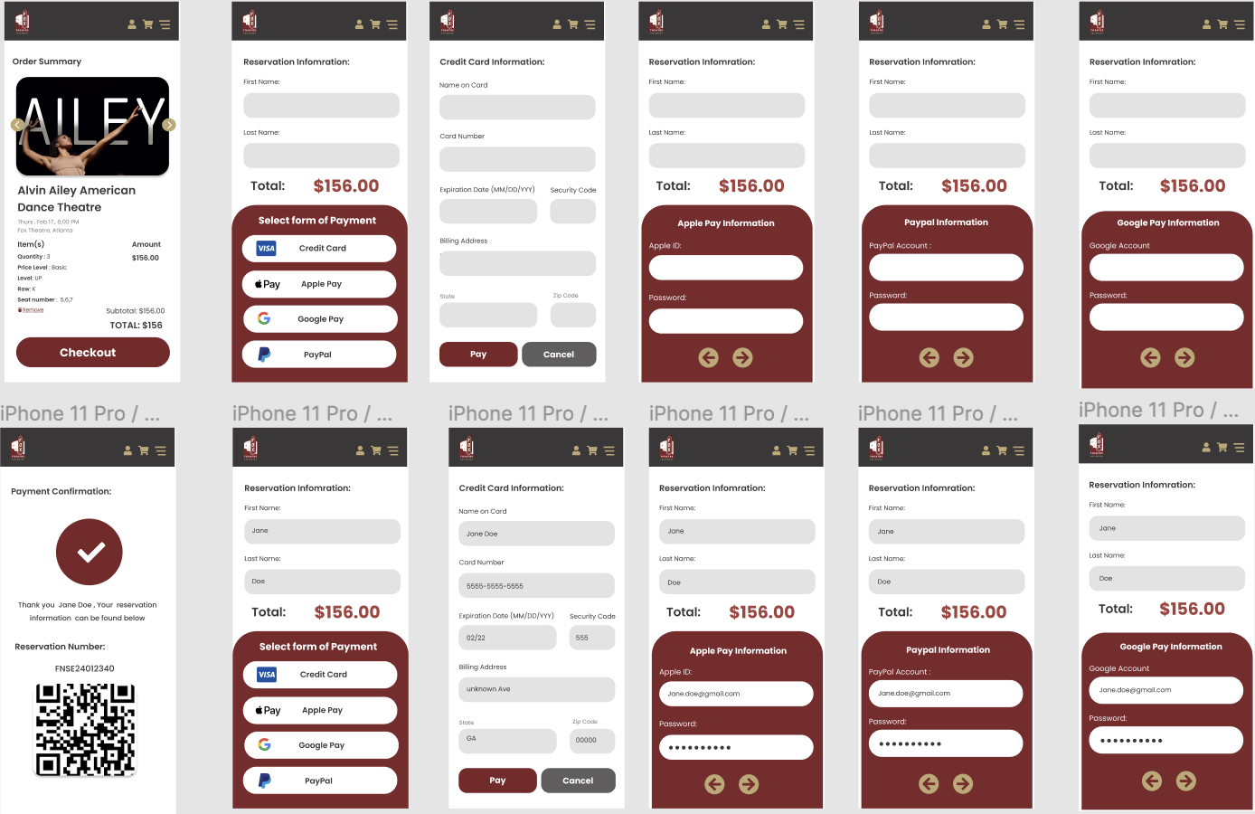
Checkout Page
Checkout Page is the last step of the purchasing process, providing a summary of the order and different payment options. Since our target group is the younger generation, we assume that they might often use more convenient payment options like Apple Pay or Google Pay.

Visual Design
Different target user groups may prefer certain styles of website design. For our target group, we assume that the younger generation may favor a minimal modern design without heavy text information.
Mood Board
Before we formally build the prototype, we searched some good design examples online, and create a mood board to gather a collection of colors, images and fonts.
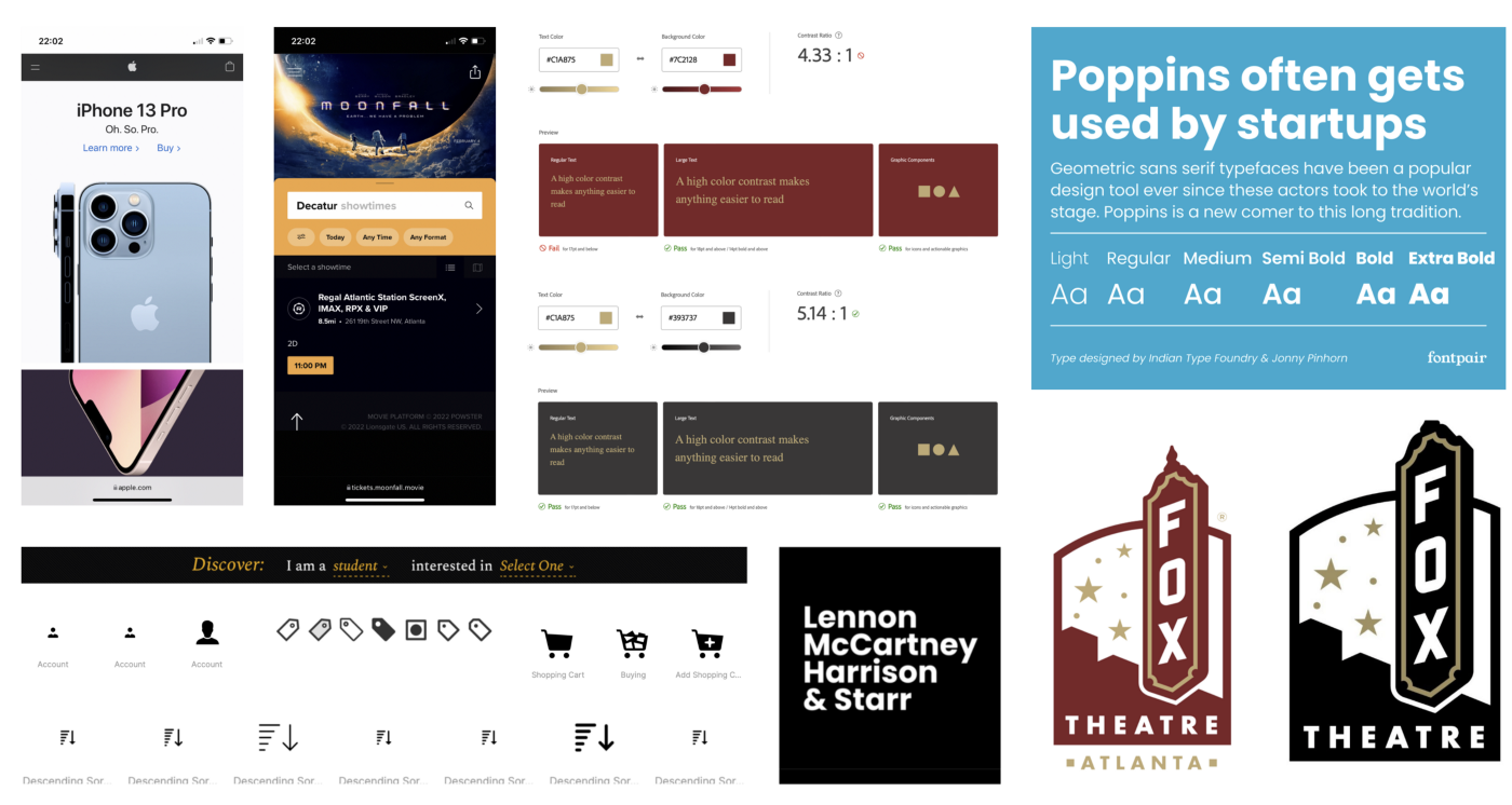
- Color Scheme: The color scheme we decided to use is based on the logo of the fox theatre, which includes three colors (#7C2128 for maroon, #C1A875 for gold ,and #393737 for dark gray).
- Font: The font we use is Poppins, a geometric sans serif font. The font has 9 different weights in Figma, from thin to black, which can be used for both headlines and texts to improve the readability. It is great for the modern design style we want to follow.
Prototype
This section shows the prototype of our design. We adopted a unified header and menu bar for each screen. And we also use pictures and text to indicate and cater for our target user group.
Homepage: On the Homepage, we put a rotating banner for the latest news and most popular events. And below the rotating banner, a Discover function allows the user to quickly select event categories they would like to explore from a drop-down menu. We also place Events and Rent Avenue sections on Homepage to explicitly inform the users what Fox Theatre could provide. In order to indicate our target user group, we choose picture of teenagers as the background of the rotating banner and as the images under Rent Avenue section.
Moreover, we redesign the Menu bar, showing the subcategories of the events, brief introduction to the Fox Theatre, and the contact information.
Upcoming Events Page: By default, this page is presented in the list view, showing the image, name, and date of the events. Compare to the original website, we also created calendar view and sorting function on this page. Users can select date and time to filter out the available events in the calendar view. Also, by choosing various tags, including subcategories, age group, price range, and group size, users can quickly get the events that are most appropriate for them.
Event Info Page: This page allows users to access a more detailed information about one specific event. For this page, we indicate our user group by adding the movie and content rating system (‘PG’ in the prototype). Another important function we redesign is the pull-up calendar for users to select the event session they want.
Booking Page: The original website lists all available ticket packages for users to select, which is hard to read and not user-friendly, especially for children aged 12–16. Therefore, we adopted the seat map since it is more straightforward.
Checkout Page: This page provides a summary of the order, including the item ordered and the total price. Considering that our target group is the younger generation, we add a variety of payment options.
Discussion & Conclusion
Our group presented the prototype without disclosing our target user group, and let the audience guess who we are designing for. Most people mentioned groups like ‘younger people’, ‘12–16 years old’, and ‘students’. Their guesses are based on the teenagers image on the Homepage, filter selection on the Upcoming Event page, and payment options on the Checkout page. However, there are audience that made wrong guesses, saying ‘large group’ or ‘unclear’.
According to the feedback from the audience, we reflected on our design and proposed few aspects for the future improvements:
- Adding more content for our user group, including private events (e.g., graduation parties and prom) and social media post.
- Modifying the misleading information (e.g. group size).