Climb towards HCI
On philosophy in my design process
Introduction
Nowadays, the heavy usage of smart devices, such as phones, smartwatches, and voice assistants, leads to the increasing interest in Human-Computer Interaction (HCI). With the development of Machine Learning (ML) and Artificial Intelligence, the interaction between humans and computers is ever-changing, which poses a great influence on our daily lives.
As a student who studies computer science, I used to focus only on developing the model behind the products but have never thought about how design can help humans better interact with computers. Thanks to the HCI course provided by Dr. Amily Wall at Emory University, I had the opportunity to get to know this field and participate in every step of the design process, including problem defining, information collecting, brainstorming & analyzing, developing solutions, gathering feedback, and improving the design.
My design experience over the last four months has enabled me to approach problems from a totally different perspective as a designer. This manifesto will illustrate the most important takeaways I learned from the past design process. These takeaways are also the design philosophy that I would like to keep in mind and follow in my future design work.
Design Philosophy
User-centered not Self-Centered
Because everyone’s problems are personal and have different causes and consequences, there is no such thing as the “average user”. Every single solution will meet some people’s needs while failing to meet others. — Amy J. Ko
The first and most important thing I learned from my experience is that we always keep in mind that we are designing for users, not ourselves. And this principle should be followed throughout the entire design process.
Starting from the problem defining, one mistake I made at the beginning of my first project was to assume the needs of users. When I was working on one project named Need Finding, in which we needed to understand users’ real needs in one specific domain. I chose the in-flight entertainment screen as my topic. Before interviewing the participants, I thought I would get ideas like ‘the machine is too old’ or ‘it should allow users to access streaming services’. However, to my surprise, none of my interviewees shared the same thought as mine. Take one of my interviewees as an example (P1). What P1 cares about most is the missing movie sync function and food ordering function on the in-flight entertainment screen.

This is exactly what Dr. Amy J. Ko conveys in her blog, How to understand problems. Our unique experiences shape our thoughts. No one’s experiences are the same, so no one’s problems are the same. And there is no one solution for all problems. What designers should do is to conduct thoughtful user research. We could communicate with users to understand their problems by using surveys, interviews, and observations. And we could use methods like the empathy map and creating personas to identify surprise and contradictions.
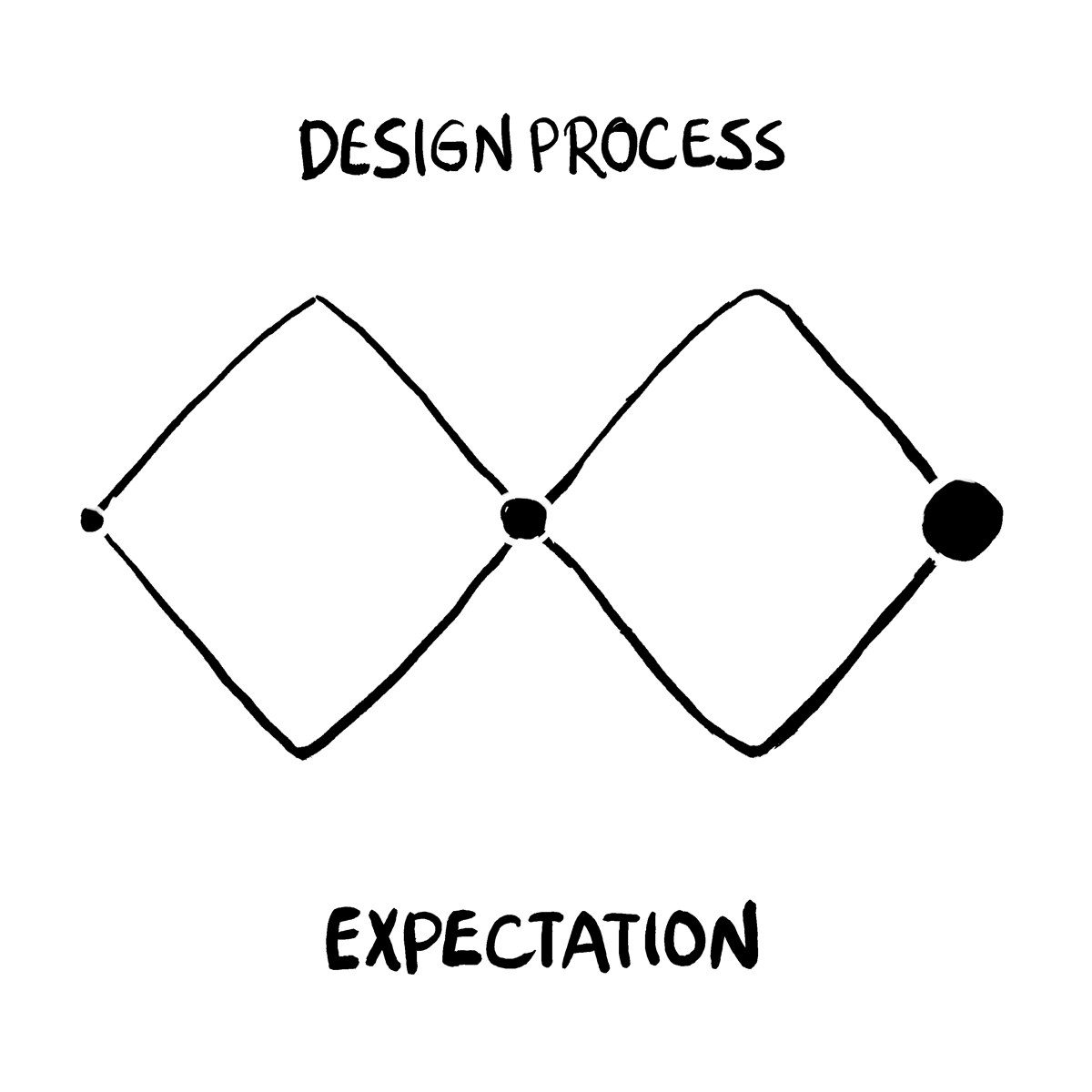
Expectation V.S. Reality
“Thinking is easy, acting is difficult, and to put one’s thoughts into action is the most difficult thing in the world.” ― Johann Wolfgang von Goethe
In the design process, it is easy to imagine what our designs would be like. However, realizing it in real life is another thing. The gif below well describes the gap between our expectations and reality. The ideation might be neat and straightforward in our heads, but the realization is much more complicated. Likely, we will encounter various constraints and issues in the design process. It could be time limit, technology barrier, required skills, or user behaviors.
I realized this gap when I was working on the Design for Understanding project. In this data visualization project, we tried to map the Billionaire dataset to visual features in both communicative and persuasive ways. Another and I were responsible for creating the unbiased and in-depth presentation of the dataset. During the ideation process, we planned to use Tableau to create an interactive world map that can show the distribution of billionaires by region and country. The larger the dot is, the more billionaires are in that region. If the user clicks on the dots, the map will zoom in to the corresponding area and show the detailed data. I spent days implementing the interactive world map. However, I later found out that our data is too sparse and does not create a satisfying visualization. Hence, I have to switch to a simpler but effective way, using the treemap to present the distribution.
This experience also affected my design philosophy. It is normal that we will undergo various constraints during the design process, and sometimes the end product may not be the same as we expected. I summarized a helpful tip from the data visualization project — Be flexible and open to the changes. In most cases, our ideas may change as the design process continues. After all, the ultimate goal of our design process is to create a useful and user-friendly product, rather than insisting on what we planned.
Detail Matters
“The details are not the details. They make the design.” — Charles Eames
The detail of the design contains a wide range of aspects, including typography, color, icons, margin, design patterns, and consistency. A good design should take all details into consideration.
An example from my design experience is the importance of button locations in the project Design for Others. I worked on the design of the Upcoming Event page of the Fox Theatre mobile website. The design received overall positive feedback from users. However, one feedback caught my attention. The user reported that the location of the ‘Clear’ button and ‘Apply’ button (circled in the following picture) on the Filters page is unintuitive. And the user mistakenly clicked on the ‘Clear’ button during the usability test.

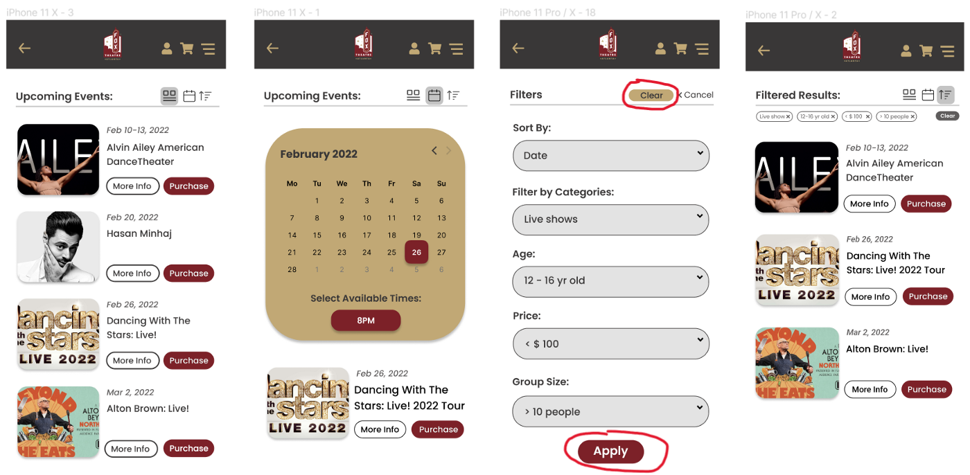
Later, I swapped the location of the ‘Clear’ and ‘Apply’ buttons on that page. And we did not receive similar comments after that. It occurs to me that small changes can make such a huge difference. One detail in the design may cause errors and thus bring a frustrating user experience. So, be sensitive to every detail in your design! It is difficult to cover all details at the beginning. One good way to start with visual design is to refer to resources like this.
Feedback Helps
“I think it’s very important to have a feedback loop, where you’re constantly thinking about what you’ve done and how you could be doing it better.” – Elon Musk
Design is never like a straight line where we can go from the start point directly to the destination. We always need to decide on different design ideas, and go back and forth to improve our design. User feedback and user testing play a significant role in this process.
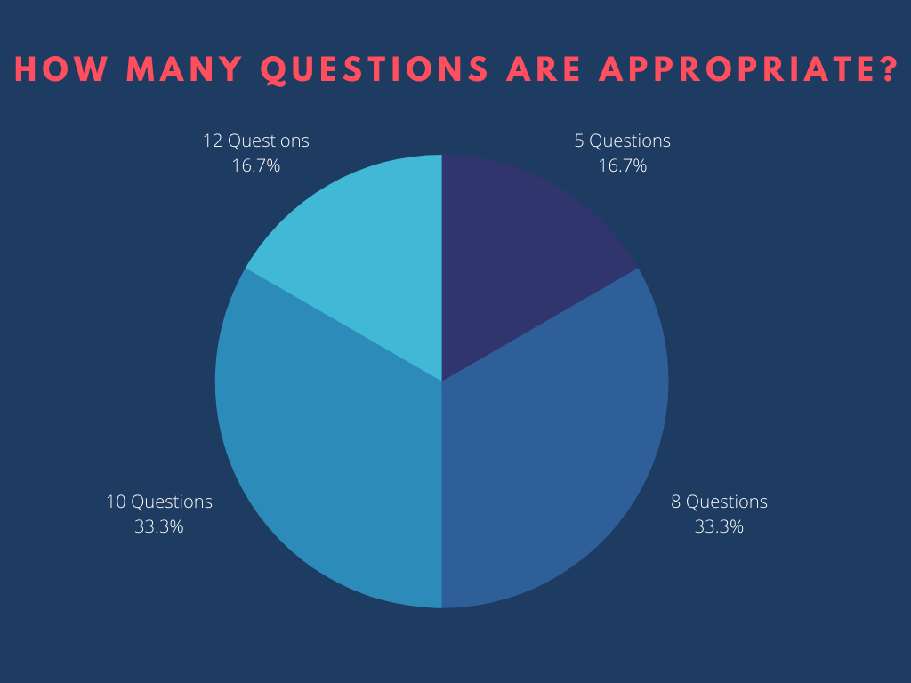
In one of my projects, Design for Tension, my team and I created a chatbot that helps users to better understand women’s health. We decided to use quizzes as the primary approach for our bot since it is more exciting and interactive than providing plain facts. However, we could not decide how many questions we should put into the quiz and how the user prefers to end the conversation. To address these two critical problems, we conducted formative user testing. Based on the feedback, we quickly figured out the answers. So, when you are indecisive in the design process, do not hesitate to ask and listen to your users!

Feedback also helps when designers try to improve their products. For instance, when I worked on the project Redesign and Extend, our team adopted the usability test during the iteration of the design. We asked the user to rate our product on a scale of 1–5 given the following metrics. The feedback shows our product should be improved in terms of Intuitive design and Error frequency and severity.

Learning how to receive feedback and survive a critique is an indispensable skill for every designer. We could apply useful methods, such as the usability test and the heuristic test to gather them. As Karen Cheng suggests in this article, we should invite constructive criticism, keep an open mind, and avoid being defensive.
Review Your Design
“You need to have a redesign because familiarity breeds a kind of complacency.” — Timothy White
Another important concept I learned from my design experience is that the design process is a loop. It does not end when you think you find the solution for the problem defined in step 1. Designers should improve their design according to users’ feedback, identify new problems, and repeat the whole design process.

In the Redesign and Extent for Fox Theatre, our team aimed to redesign the mobile website based on our original Figma prototype. We created a design process board to collect information in each design step, in which we tried to iterate the design process and redesign based on the newly identified problems.

Using this method, we jumped out of the original design and found previously ignored problems, including the missing ‘backward’ function on all the pages we created. The negligence is because we are too familiar with our own design and often fail to recognize the potential problems. Even design experts are possible to be traped by familiarity. Hence, it is necessary to review and redesign your project, which will give you a whole new perspective to the problem.
Inclusive Design
We should all … understand how each of us is an individual and is unique, but also focus on what is universally important to all of us. That way, we can increase access, reduce friction, create a more emotional connection — in literally whatever you design. — Tim Allen
Seeking inclusive solutions in our design is quite challenging. There are two concepts that are closely related to inclusive design: universal design and accessibility design. The former refers to creating one experience that could be accessed by all the people, while the latter allows people with disabilities and impairments to use the design. Hence, the goal of inclusive design is to design products that can be used by people of all backgrounds and abilities.
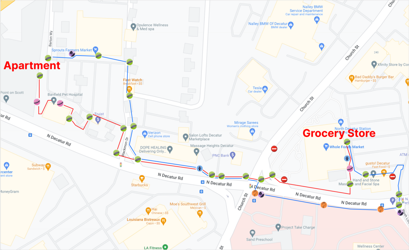
I worked on a project named Campus/Town Accessibility, inspired by the Project Sidewalk. For this project, I assumed myself as a person with mobility impairments and would like to go grocery shopping at a Whole Foods Market nearby my department. I created an annotated map of the routine, labeling both accessible options and problematic areas I found along the road.

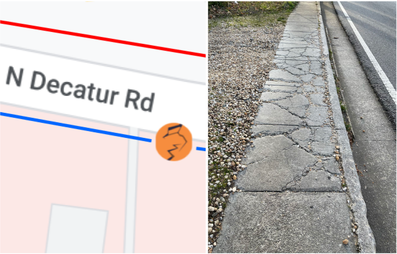
I was surprised to find that there are so many problematic areas that may cause potential dangers to people with disabilities. For example, one problematic area has a severe surface problem. The cracks on the sidewalk will create an extremely uncomfortable experience for people with wheelchairs and other assistive devices. Also, the sidewalk is too narrow to allow the wheelchair to rotate.
From this experience, I realized that inclusive design has been largely ignored in our daily lives. The valuable lesson I learned from it is that consider every “edge case” in our design process. As designers, we should always bear in mind that people around us are diverse. And we need to develop empathy to understand the diversity. For example, when we are testing our products, we should hire people from all backgrounds and abilities.
Conclusion
To conclude, I would like to quote a sentence from Hillman Curtis.
“The goal of a designer is to listen, observe, understand, sympathize, empathize, synthesize, and glean insights that enable him or her to ‘make the invisible visible.’ — Hillman Curtis
For me, the HCI experience is like climbing mountains. I encountered various design challenges and experienced frustrating moments. However, I am also able to observe a lot of previously ‘invisible’ views and hope to find more during the journey. Though I am no expert in this field, I still hope this manifesto would help people who are new to HCI and would encourage more people to join this journey.
