Need Finding
For in-flight entertainment screens
Problem
Need finding is a significant design process, aiming to discover who our customers are and what tasks we should tackle in the later design process. This post presents the need finding process for in-flight entertainment screens.
The aspect of the airport experience I chose to investigate is the seat-back screens on the airplane, as known as the in-flight entertainment screens.

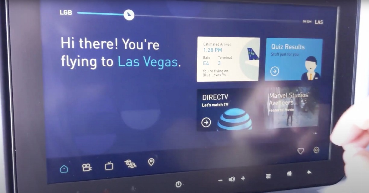
As shown in the above screenshot, the in-flight entertainment screen is usually located on the seat back, allowing passengers to check the flight information, watch movies, listen to musics, play games and etc. Most people would be familiar with this screen since it is one of the most frequently used item on the plane. However, not all people are satisfying with the design of it. In order to figure out the real need of the end users, I further conducted short interviews (~20 mins per interview) with 3 participants.
Interview Preparation
Before I started interview, I reviewed my problem and list few questions I could ask the participants.
- Tell me about the last time you take a flight.
- How do you feel about the in-flight entertainment screen?
- What is the aspect of the in-flight screens are you most satisfied/unsatisfied with?
- Why do you feel in this way?
- Could you tell me more about that (specific) experience?
These questions are generally open-ended, which may allow me to dig more into the experiences or stories that participants have on the problem. Besides, during the interview process, I tried my best not to provide the expected answers to the participants and be as flexible as possible.
Hiring Participants
Due to the pandemic, it is difficult and unsafe to go on the street and interview strangers. So, I started with looking for potential participants on social media and in my neighborhood.
Participant 1 (P1): P1 is a software engineer working in an asset management company. We followed each other on Instagram since we have mutual friends. P1 always posted photos and short videos about their trips, which includes photos in the airports and on the plane. So I decided to reach out arranged a meeting online. I chose P1 because P1 travels regularly with P1’s partner and could have a lot to say about my problem.
Participant 2 (P2):P2 is a digital marketing manager working in fashion industry. P2 moved from New York to Atlanta a year ago and currently lives in my apartment building. I met P2 in the weekly fitness course in our apartment gym. And during our conversation, I learned that P2 is a newly graduated international student and has took international flights for a lot of times. Hence, I asked P2 to join my research and interviewed P2 in the apartment common area.
Participant 3 (P3):P3 is a student and is currently enjoy their gap year. P3 is the partner of one of my friend. Though I have never met P3 before, I know P3 could be a great participant since they are in a long-distance relationship and always take the flight to see each other. Since I did not want to include my friend in the interview, I asked P3 instead and finished the interview online.
Empathy Map
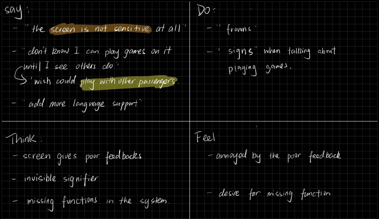
For each interview, I created an empathy map with highlighted parts to analyze it. The highlighted part in the same color are similar comments from different participants. For example, all three participants have similar comment on the touchscreen of the entertainment system, which is labeled in orange.


Findings
Through creating the empathy maps, I found some important insights. The touchscreen of the entertainment system seems to be a headache for all participants. The screen sometimes is not sensitive and users need to tap several times to get it work. And users are usually feels frustrated or annoyed by this poor feedback.
One thing that really surprised me is the sync function mentioned by P1 and P2. P1 wishes to watch movies with P1’s partner simultaneously. P1 said they have to adjust the movie manually. And if they go to restroom in middle, they would have to do it again after coming back to seat. P2 also mentioned it would be great if people could play games with nearby passengers. Hence, this is a missing function in the in-flight entertainment system. To improve the user experience, we might consider adding this function.
Besides, P1 and P3 both complained the way that the flight sells food. P1 thought it would be more convenient and efficient to order food on the screen while P3 really hate flight attendants selling foods with the cart. So, enabling users to order refreshments on the screen would be a better solution to their needs.