
Design for Tension
Women’s Health Chatbot using FlowXO
Introduction
This group project aims to create a chatbot that could help our users correct common misconceptions about women’s health. In this blog, I will first introduce the framing process of our chatbot, defining the topic, the user group, and our goal. And then, I will illustrate how we ideate the chatbot, including brainstorming, sketches, and flowchart. At last, I will present how we implement the chatbot using Flow XO.
Framing Chatbot
As its name indicates, our chatbot is about women’s health. Here, the scope of ‘women’s health’ is widely-spread common misconceptions about women’s health on social media platforms such as Facebook and Twitter. The usage of social media platforms has been vastly increased in recent years. People are receiving various information from those platforms every day. However, some information on social media might be extremely misleading.

Our group conducted research online and found that women’s health is one of the tensest topics. The reasons include but are not limited to the following:
- People do not get enough education regarding women’s health and do not even think they should care about it.
- People intentionally politicalize women’s bodies and choices while ignoring their actual needs and rights.
- People tend to believe any widely believed information without checking its authenticity.
Though there are plenty of medical websites or official social media accounts that deliver the correct information about women’s health, and people are recognizing that better sex education and education of everyone about women’s bodies are necessary, misconceptions like ‘bras can cause breast cancer’ are still spreading on the internet.
Based on our research results, our target user groups would be:
- People who have misconceptions about women’s health.
- People who are unlikely to learn about women’s health actively, such as men.
- People who have strong beliefs about policies related to women’s health.
Hence, our goal for the women’s health chatbot is to educate people by clarifying common misconceptions and increasing the exposure of people to correct women’s health information. We want to build a chatbot that pushes people out of their filter bubbles and is conversational and friendly.
With all the work we did, we are finally able to generate the how-might-we statement: How might we build a chatbot that can help users to learn more about women’s health in an interactive and interesting way?
The tool we are using for this project is Flow XO. It enables users to publish their chatbots on popular platforms like Facebook and Slack. Also, it will generate a weblink for sharing the chatbot and embedding the chatbot on any webpage we want.
Ideation
Brainstorming
After deciding the topic, user groups, and the goal of our chatbot, our group started to brainstorm by collecting existing common misconceptions and myths about women’s health online.
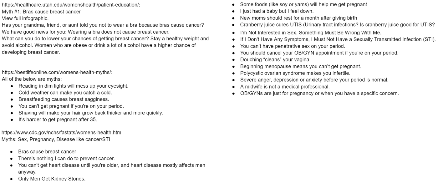
Besides, we discussed what approaches should be used to guide our users to the goal via conversation. We examined several methods within our group and decided to use the quiz as the primary approach for our bot. The reason is twofold:
- The personality of our bot is friendly and helpful, using clear and conversational language. Using the quiz matches our design goal and our user groups. Timely responses after quiz questions will direct our users to the correct answers and helpful resources quickly.
- A quiz is more exciting and interactive than just providing plain facts to the users. It will avoid driving our users away.
We further created possible quiz questions according to previously collected misconceptions and myths.


For each quiz question, we provide the question format (e.g., true/false, single choice), the correct answer, a brief explanation of the answer, and the corresponding resources to the question.
Sketching
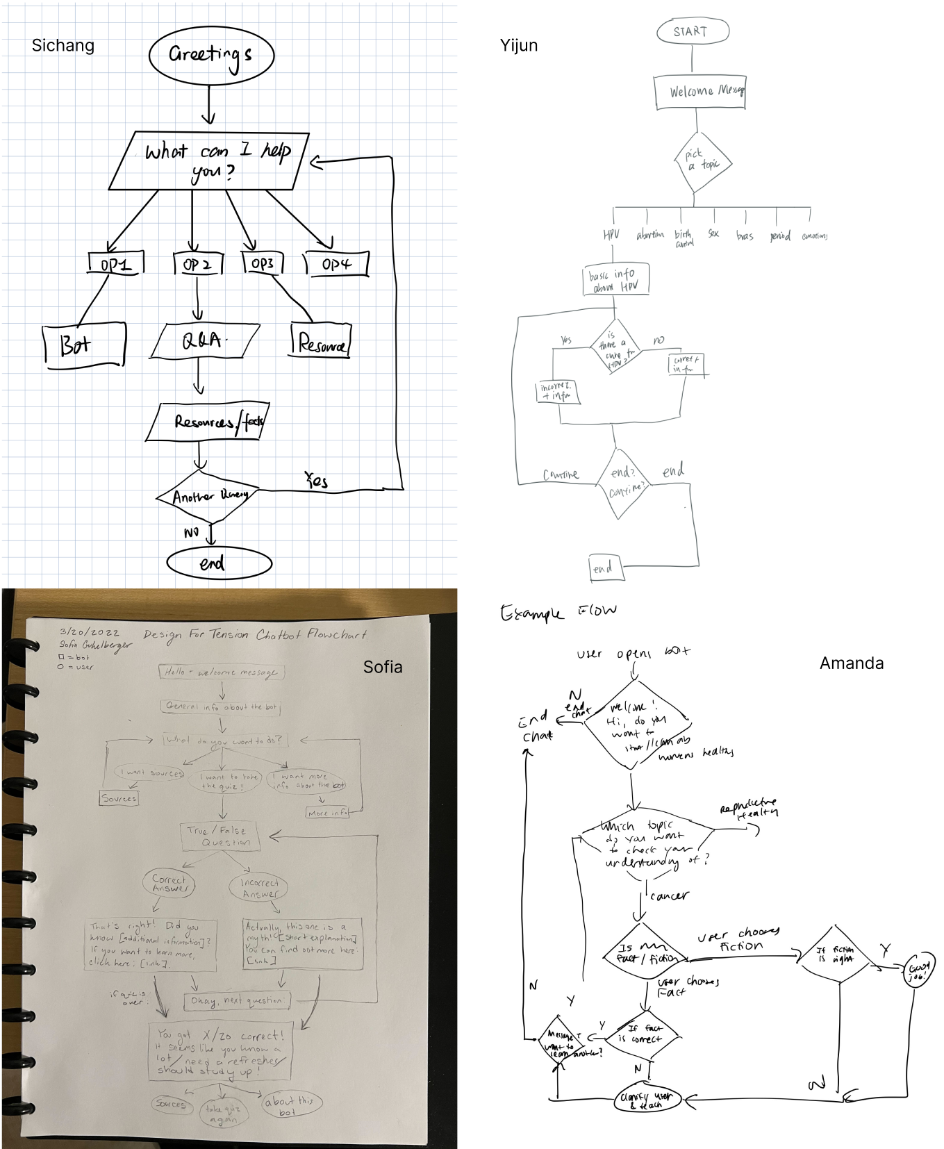
Apart from generating possible quiz questions, our group also created sketches for the chatbot, visualizing the flow of the conversation before we implemented our ideas.
Formative User Testing
Before we started programming, we conducted informal user testing on our design. The goal of this user testing is to answer the following two questions:
- How many questions are appropriate for the quiz?
- How does the user prefer to quit the chatbot?
The test results show that over 66% of users (8 out of 12) think 8~10 quiz questions would be appropriate. Hence, we decided to create a 10-question quiz for the chatbot.
As for the second problem, we split users into 2 groups. Group 1 will be asked if they want to quit after every quiz question, while Group 2 are told at the beginning of the quiz they can leave at any time they want. The result shows that Group 1 answered 2 questions on average. But Group 2 answered all questions. So, we decided to tell users that they can quit at any time.
Implementation
My main contribution to the implementation is creating the framework of our chatbot, the main menu and bot info flow, and part of the health resources flow using Flow XO. In order to present our bot in a clear and straightforward way, I also drew a high-level flowchart for our bot.
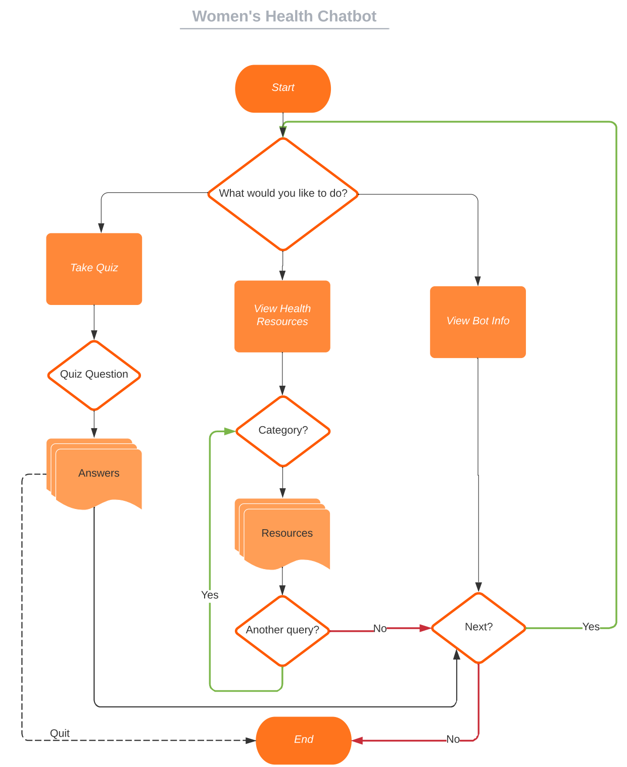
As shown in the above screenshot, the chatbot contains 3 flows, including Take Quiz, View Health Resources, and View Bot Info. Due to the limitation of the Flow XO free account (3 flows max), I combined the main menu with Bot Info. Users can freely choose which section they would like to go to, and will be asked if they would like to make another query or go back to the main menu at the end of each section. And if the answer is no, the conversation will end.

The above gif shows how users will be asked to make the choice after saying hello to the chatbot.
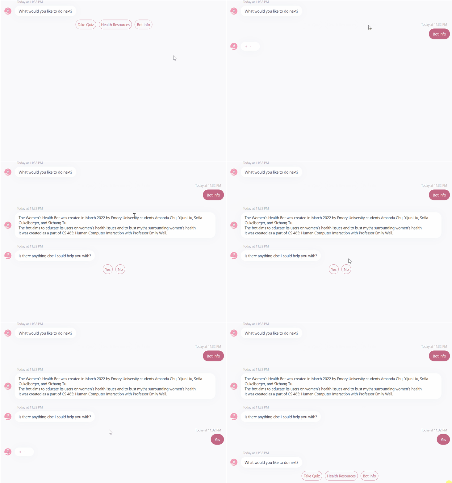
If the user chooses Bot Info, the chatbot will provide a detailed introduction to the chatbot and ask the user to decide whether they would like to go back to the main menu.
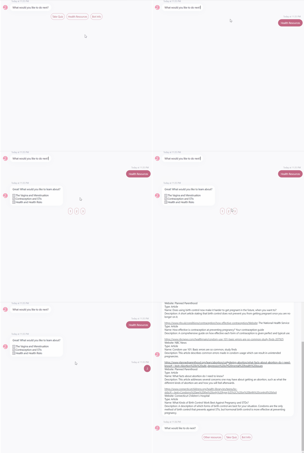
If the user chooses Health Resources, the bot will present three categories for users to select and then provide corresponding resources. Again, users will be asked what they would like to do next at the end.
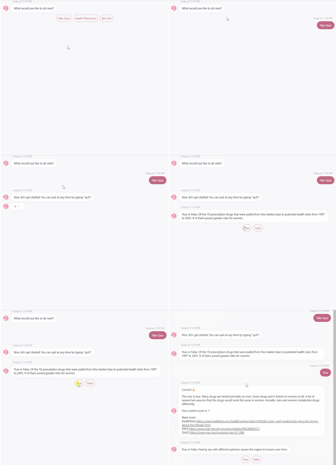

As for Take Quiz, our bot will provide correct answers, brief explanations, resources, and users’ current scores after each question. And at the end of the quiz, our bot will report the quiz summary to the user and ask them if they want to learn more about the category they did badly in the previous quiz.
Final User Testing
After the implementation, we tested our chatbot with real people and collected their thoughts.
According to the test results, our chatbot did well on:
- Providing helpful resources.
- Using emoji to encourage the user.likely to learn about women’s health actively, such as men.
- Using emoji to encourage the user.
And the chatbot also needs improvements regarding:
- More specific question description. For example, ‘birth control pills’ refer to urgent birth control pills like plan b or long-term birth control pills.
- It would be great if users can input keywords to search for related articles.
- Resources are too long to read. Better if they can be article titles with hyperlinks.
- More detailed feedback. For example, which topic does the user get the most scores on.
These feedback are valuable and could guide us to further improve the design of our chatbot.
Final Work & Demo
Our chatbot is available online, and you can find it here.
Also, we created a demo video to better present the bot:
