Arcade Machine Style Theatre Kiosk
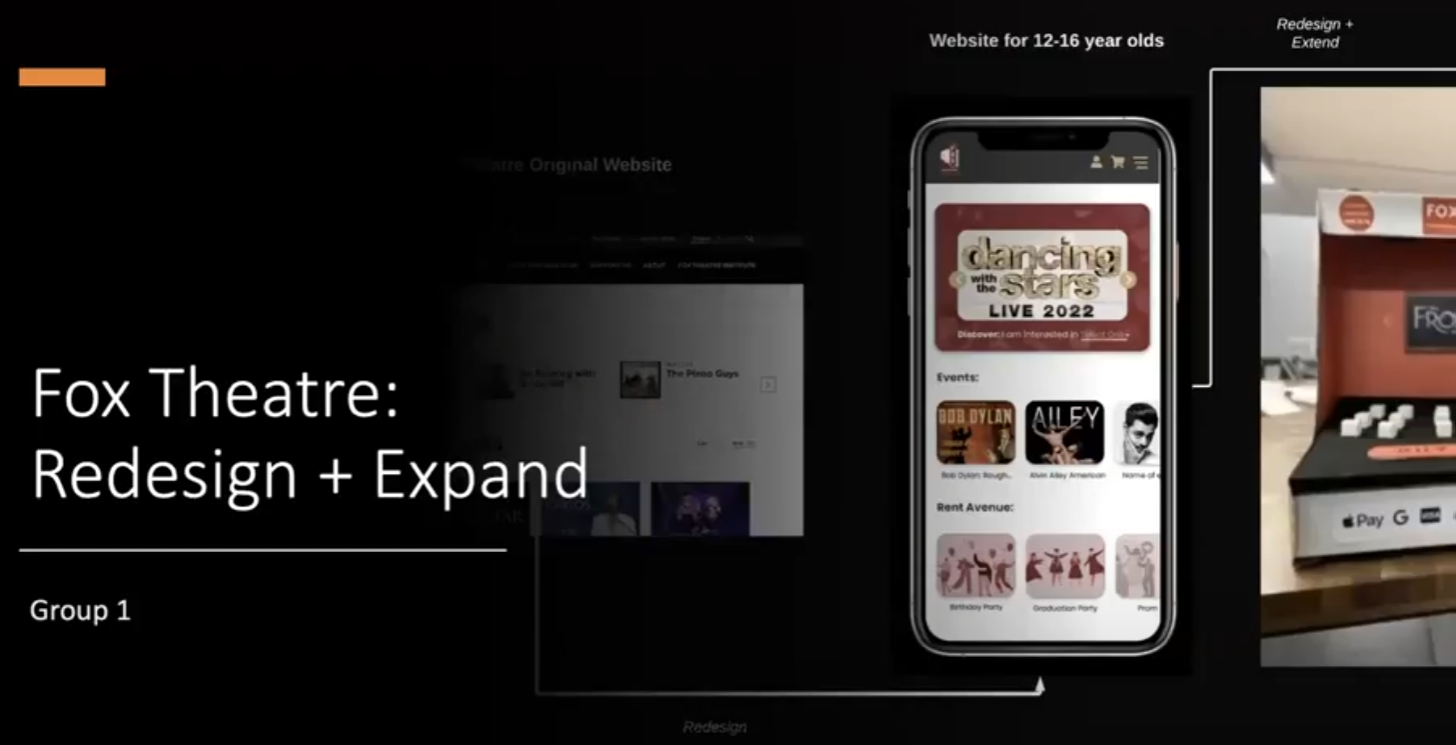
Fox Theatre website redesign and extend for children aged 12–16
Introduction
For this project, my teammates and I revisited and extended our Design Sprint 1: Design for others. In our previous design, we redesigned the mobile website of Fox Theatre for the target user group of children aged 12–16. This time, we took a step further to improve our mobile website based on evaluation results and expand it by creating physical prototyping. This blog will first present the evaluation we applied to our previous design. Then, I will reflect on the evaluation results and how we implement changes to our previous design. And last, I will show the design process and final work of our physical prototyping.
Evaluation
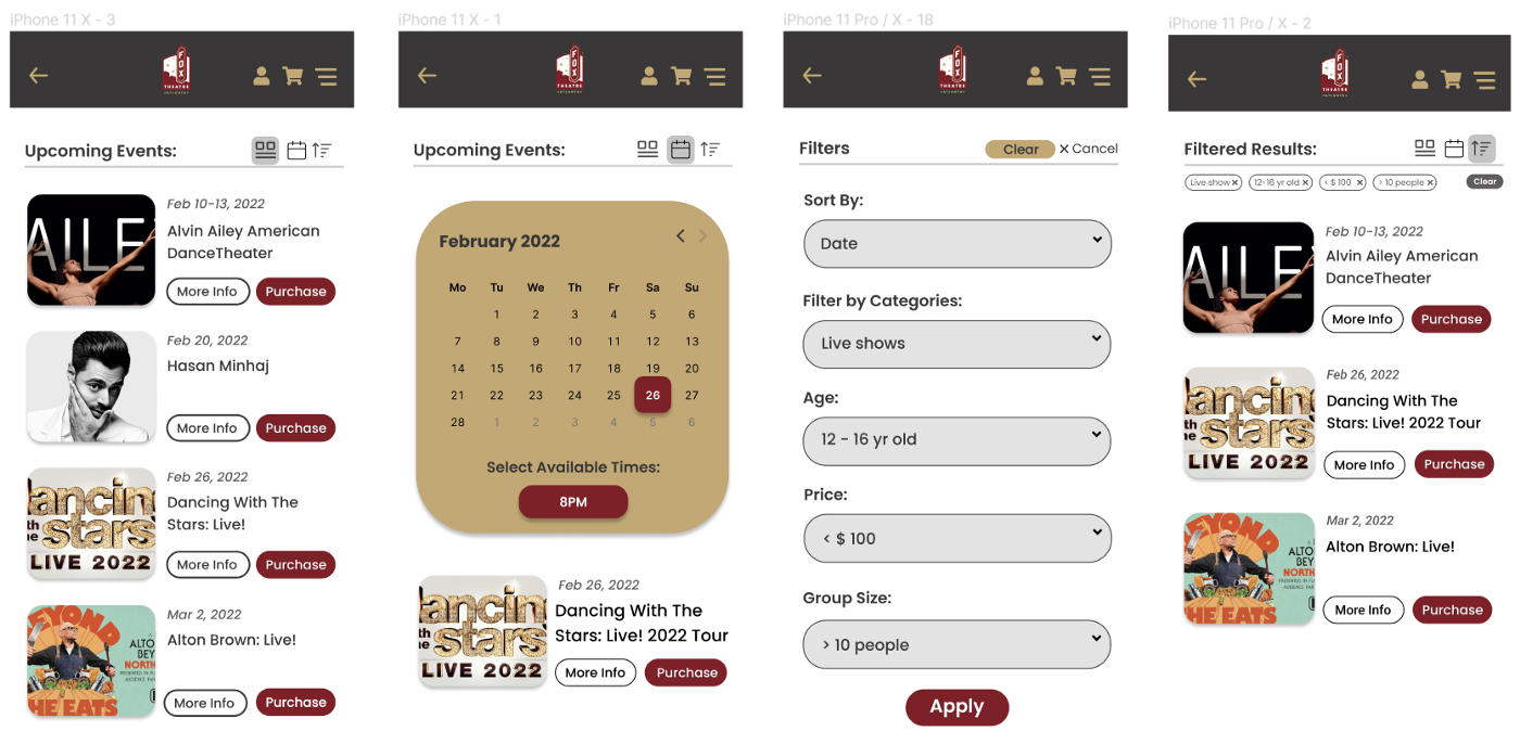
Our original design contains 5 screens, namely Homepage, Upcoming Events, Even Info, Booking, and Checkout, to reproduce the online ticket purchasing process. In order to evaluate the original design, we adopt both peer feedback from classmates after our class demo and usability evaluation to evaluate the Figma prototyping.

Peer Feedback
After the class demo, our group received a lot of valuable feedback from our classmates. Besides the positive feedback, we concluded the most common suggestions as follows:
- Website navigation should be more clear. We should add a ‘backward’ button to allow users to go back to the previous page and modify their selections.
- The hamburger menu on the homepage could be improved, covering more functionalities.
- Upcoming event filters should have more options provided. Also, the ‘apply’ button on the filter page should be more apparent and exchange the location with the ‘clear’ button.
- The payment page should include the email address so that users could receive confirmation via email. Besides, payment options on different pages should be consistent.
- The booking page should provide more options for users to choose the seating.
- The target group is not clear in our design. We should emphasize our target group.
Usability Evaluation
Besides the peer feedback, we also applied usability evaluation, which evaluates the quality of a user’s experience when interacting with products or systems. Our usability evaluation contains 5 factors including intuitive design, ease of learning, efficiency of use, memorability, error frequency and severity, and subjective satisfaction.

We asked our friends, family and classmates to rate our original design based on the 5 dimensions shown in the screenshot. The results show that we need to improve our design in terms of intuitive design and error frequency and severity. For intuitive design, participants commented that when they want to go back to the previous screen, the only way is through the hamburger menu, which is not straightforward enough. For error frequency and severity, one participant said it is easy to mistakenly click on the wrong button on the filter page and the seat selection page.
Iteration
Reflection
Based on the evaluation results, we reflected on our original design and concluded several significant improvements we need to make.
- Add more target-group-related events and information to emphasize our target group.
- Simplify the navigation on the website.
- Make buttons on all pages clear and consistent.
Implementation
In our original design, I worked on the Upcoming event page, which presents the upcoming events in different views including list view, calendar view, and filtered view.

Based on the evaluation results, I first moved the theatre logo to the middle and added a ‘backward’ button on the navigation bar, enabling the user to go back to the previous page easily instead of using the hamburger menu. Besides, I changed the location of the ‘Apply’ button and the ‘Clear’ button on the filter page, which reduces the possibility that users would mistakenly clear all their selections.
Extend
Physical Prototyping
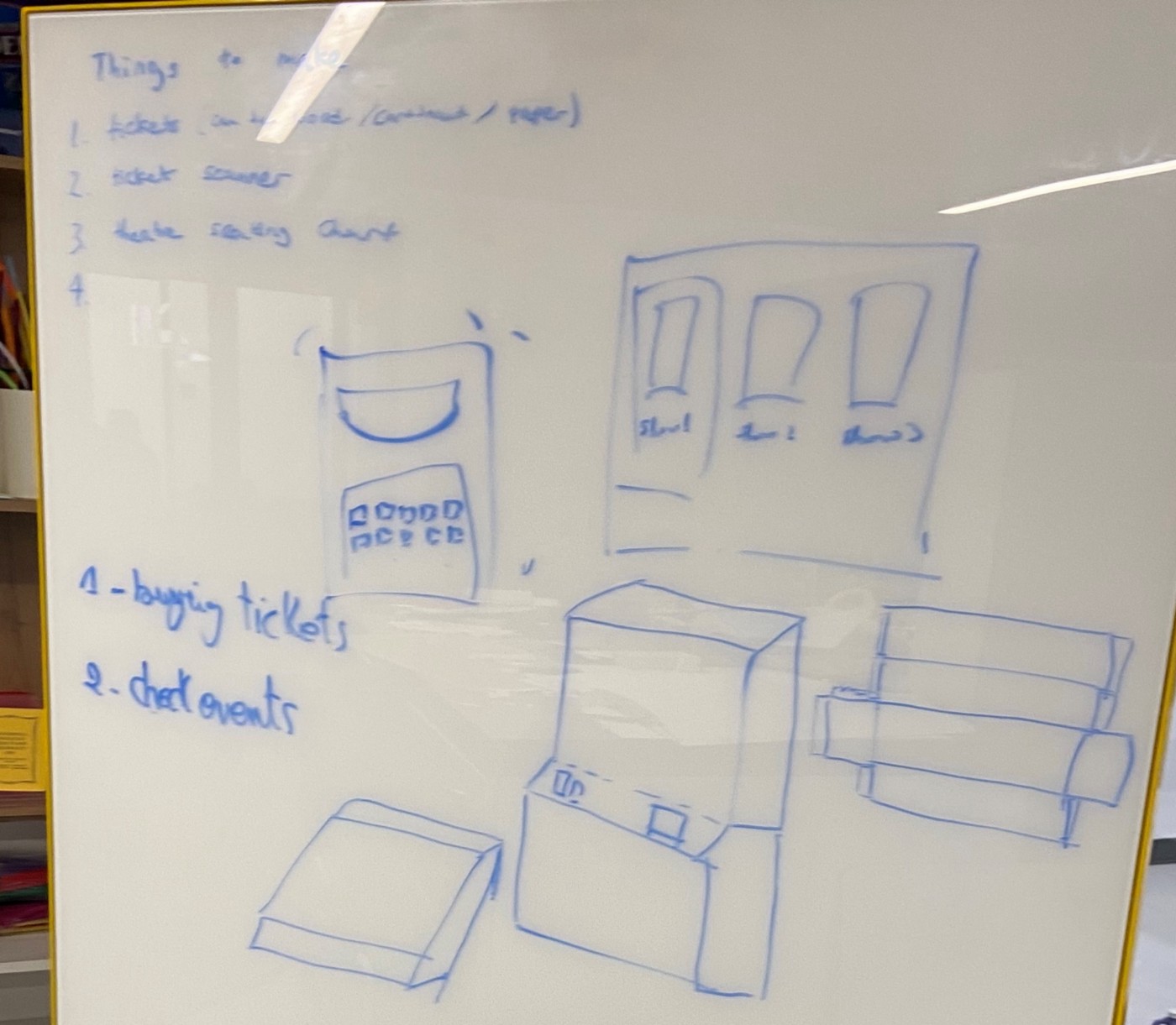
For physical prototyping, we started with collecting ideas and thoughts in terms of the following 9 dimensions.

Regarding the form of the physical prototyping, We considered a few different options, including modern all-in-one touchscreen, virtual reality devices, smartwatch, and the arcade machine style kiosk. Considering our target user group are children aged 12–16. We think the retro arcade machine kiosk would be a better option to cater to our target group.
Since our original design contains five different screens and plenty of subpages, it is not practical to cover all content in the physical prototyping. So we decide to focus on one particular aspect. Since selecting seats and purchasing tickets are the most important kiosk features. We would like our physical prototyping stimulates this process in a simple and straightforward way.
At this step, our goal for the physical prototyping became clear. We would like to create an arcade machine style ticket kiosk with a touch screen and an accessible seat map. After deciding on the form and goal of our physical prototyping, we created sketches to better visualize our design.
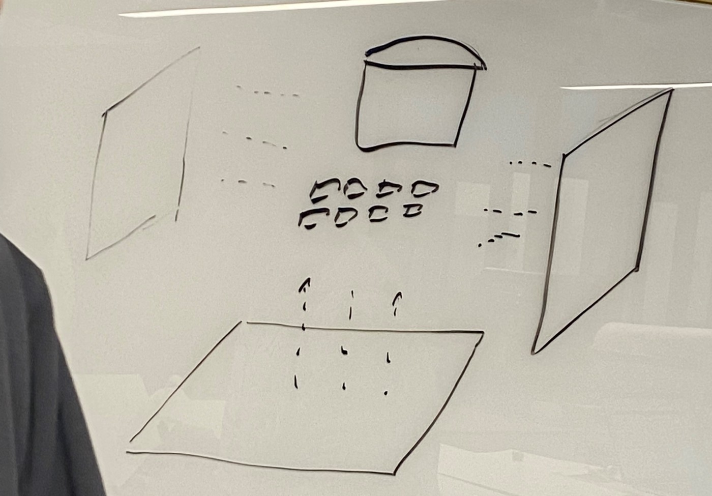


Our kiosk is comprised of four major components: the tough screen, the seat map, the ticket box, and the ticket. We used cardboard to build the body of the kiosk and the ticket box and covered them using colored paper that corresponds to the color scheme we used for the website. As for the touch screen, we printed the event to indicate that users can operate on the screen. And for the ticket, we used Canva to design it and printed it using hard paper.
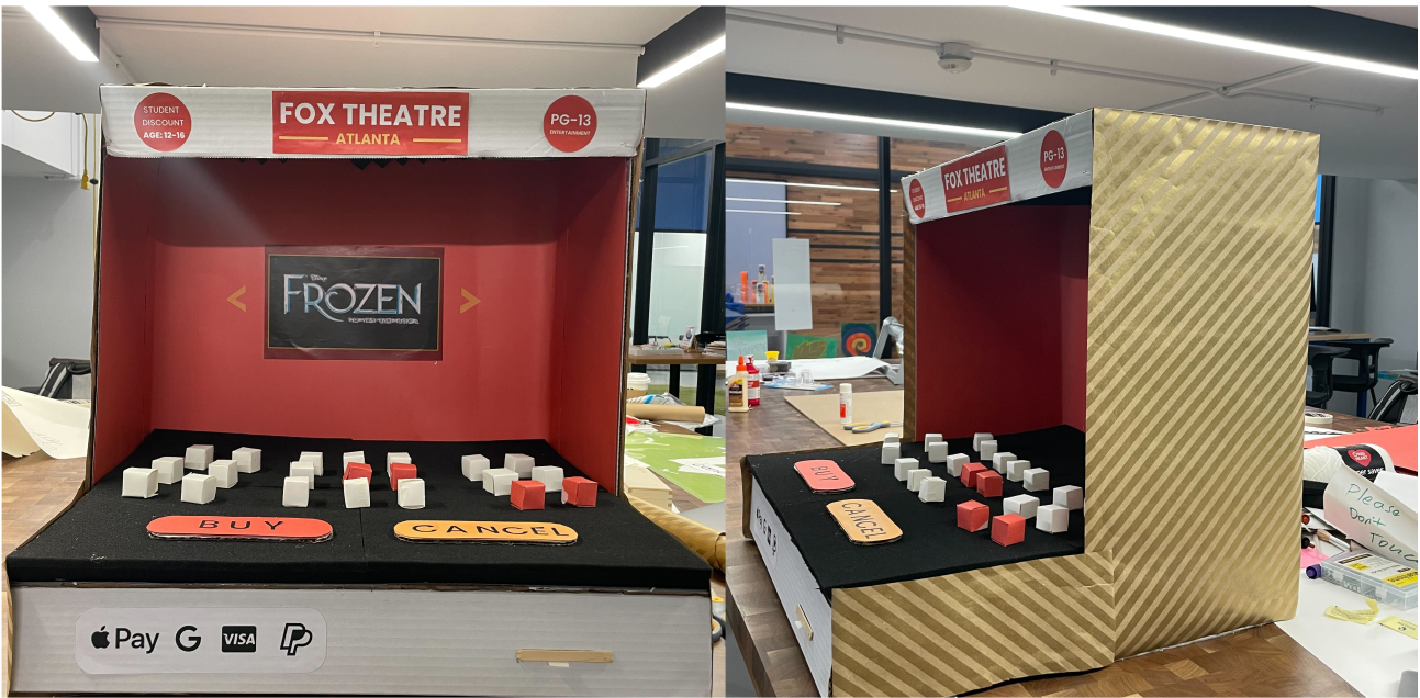
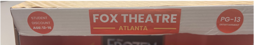
Header: Our kiosk has a header that highlights the ‘PG-13’ and also ‘Student Discount’, emphasizing our target group.
Touchscreen: The touchscreen presents the currently available events in the theatre. Users can simply use their fingers to scroll back and forth to select different events.

Seat map: After the user selects the event, a seat map will show up, allowing users to choose their seats. Users can select/deselect seats by touching them. The selected seats will turn red.

Ticket box: The ticket box carries the payment area and the ticket slot. After clicking on the ‘BUY’ button, we can simply tap our phone or card on the payment area to make the payment. And then, the tickets will come out from the ticket slot on the right side.

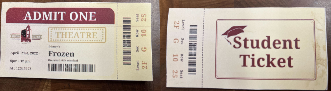
Tickets: The design of our ticket also follows the same color scheme as our Figma website design. We also indicate our target user group on the back of our ticket, showing it is a student discount ticket.
For the detailed Figma Design and physical prototyping, please find our design here and take a look at our demo video:
Re-Evaluation
For our final work of physical prototyping, we run an informal evaluation by asking students in the hatchery. And we got pretty positive feedback and also some suggestions. According to the informal feedback, what we did great is the style of the kiosk looking, the 3-d seat map, and also the design of the ticket. However, there are several things we could further improve:
- It would be great if the touchscreen had more events indicating users could scroll back and forth.
- Give the users options to check the details of the selected events.
- The payment area could be more apparent.
Conclusion
In conclusion, our team created an arcade-style kiosk that allows users to purchase tickets in a simple and straightforward way. We reflected on the previous evaluation results by using clear kiosk buttons and adding more information targeting our user group. Overall, This project is very interesting, enabling us to learn how to design and create physical prototyping from scratch.