Good / Bad Design
On Emory's Websit
Good Design
What is it?
The good design I chose is the homepage of the Emory Transportation website. As shown in the screenshot below, the webpage contains mainly three sections besides the top navigation bar and footer. The first section contains 1) a rotating banner of important events and information; 2) a Discover function that enables users to locate the information they are looking for quickly. The second section shows the latest news and social media content. And the last section offers a more detailed site map.
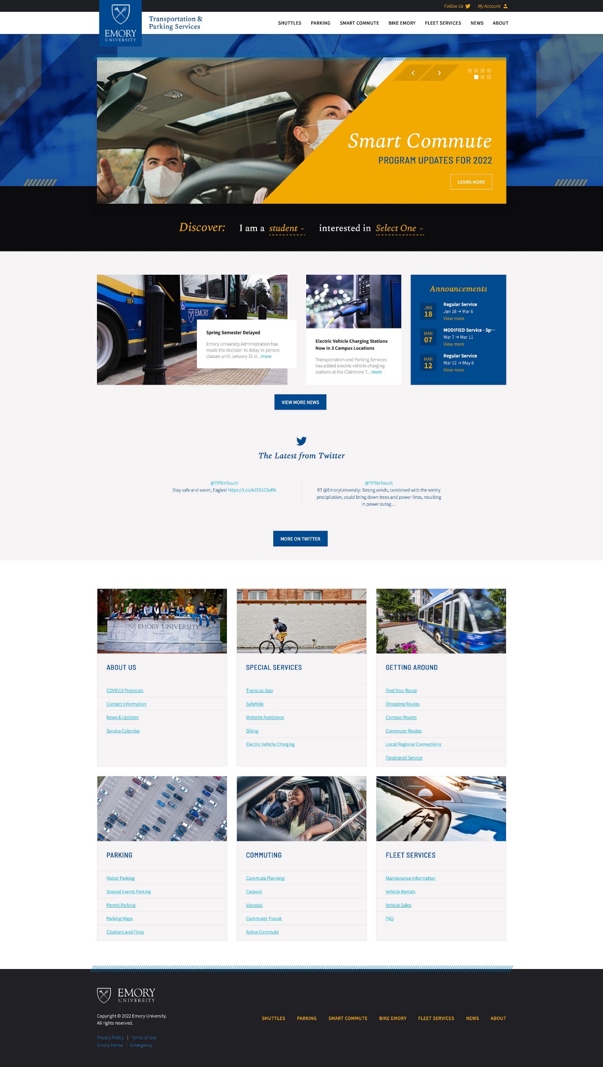
This website is designed for students, faculties and visitors who want to acquire transportation information (e.g., shuttles, parking, and commute). Take myself as an example. When I came to Emory for the first time, I used this website to look up the shuttle route and schedule from my apartment to the school. And later, when I purchased a car, I used this website to apply for my parking permit.
Why is it?
The reason why I think this website is a good design are as follows:
- The UI design is clean and uncluttered. The website places the most important information in the unfolding area to make it easier for users to find the information they are interested in. It also provides a detailed site map for some uncommon functions or less critical information.
- The website did well in terms of discoverability and understanding. For example, the Discover function in the first section provides a fill-in-blank sentence (‘I am a ___, interested in ___.’) to guide the user. So the affordance is fully visible. Also, they put signifiers ‘Select One’ so that users will understand that they can select different options from the drop-down menu.
- The website has immediate feedback. Generally, the operation on this website is smooth. If you use the Discover function mentioned in reason 2, it will redirect you to another web page that contains further information once you fill in the two options.
Bad Design
What is it?
The bad design I chose is the Emory interactive map. This website allows users to look up all buildings and directions on the campus. As shown in the screenshot, the website provides a campus tour video on the top of the left sidebar. Using the search box in the left sidebar, users can search for buildings. The detailed information will show up as a pop-up window in the map area. Also, users can select different types of map views in the top right corner and zoom in/out in the bottom right corner.

This interactive map is designed for anyone that wants to inquire more information about the campus building and directions. People will use it if they need to get familiar with the campus or if they would like to find specific facilities within the campus (e.g., parking lots and emergency phone locations).
Why is it?
For this website, I think there are few things that it does not do well:
- The website places the signifier ‘Emory Campus Tour’ on the top of the left sidebar. But when the user clicks on it, a side window will show up and tell the user the video is unavailable. So the feedback here is poor, which may annoy the users.
- Some information provided on this website is hard to understand. As shown in the pop-up window in the map area, the detailed information of one building contains its address and several links to different locations, such as Severe Weather Location and AED location. The confusing part is that users may not understand what Severe Weather location and AED location mean and how they should use them. If we click on the Severe Weather Location, another pop-up window will show up below, which is even more confusing. There is no way a first-time user would know what E110 (Hallway) stands for. Again, the design of this website does not communicate the necessary message.