Airport Design
Prototyping in-flight entertainment screens
Introduction
As a quintessential design activity, sketching is a handy tool to prototype a product. This post presents the design process for the in-flight entertainment screens. The aim is to provide feasible solutions for the problems discussed in the previous Need Finding post. This post focuses on 2 major problems, presents sketches for each problem, and demonstrates the prototype for the redesign.
What users need
Based on the results of the need finding, I conclude few aspects that can be improved for the in-flight entertainment screens, including screen sensitivity, page loading speed, food ordering function, and sync function for movies and games. However, some aspects are difficult to improve merely by the redesign, such as improving the screen sensitivity or speed up the page loading. Hence, I narrowed them down to the following two aspects:
- Adding more language support: it allows user to change the language of the in-flight screen system.
- Food ordering on the screen: using this function, users can easily order food or drinks on the screen instead of waiting for the attendants to show up.
Sketching for Ideation
For each aspect listed, I created ~10 sketches. Due to the space limitation, I just place a few to illustrate various idea I got for each aspect. The full document of the sketching can be found here.
Language Support
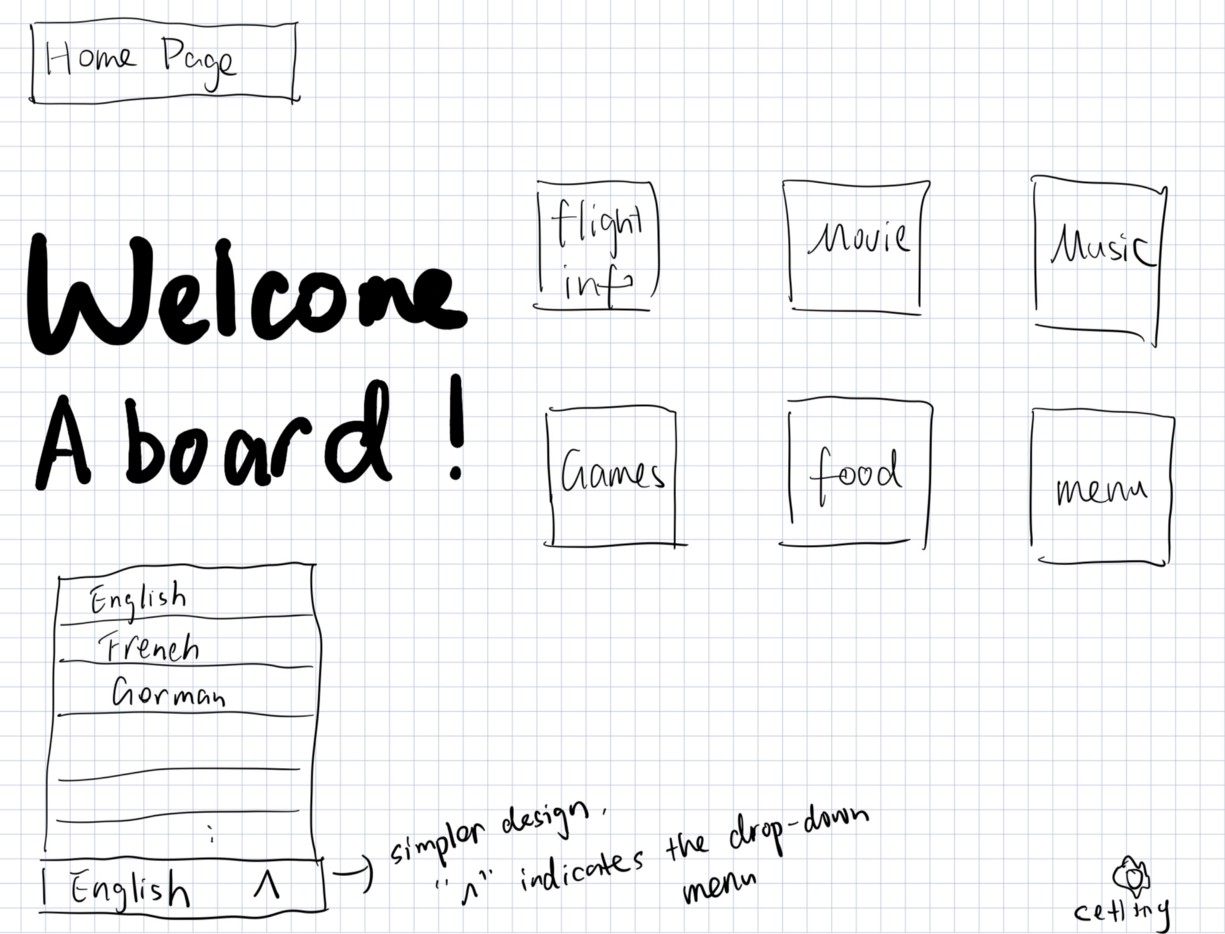
1. Drop-down menu
The first idea that came to my mind is of the drop-down menu for language selection, which allows users to select the language they prefer easily. A lot of multilingual websites use this method. Here I put the function on the home page, since it could be easily found by users.
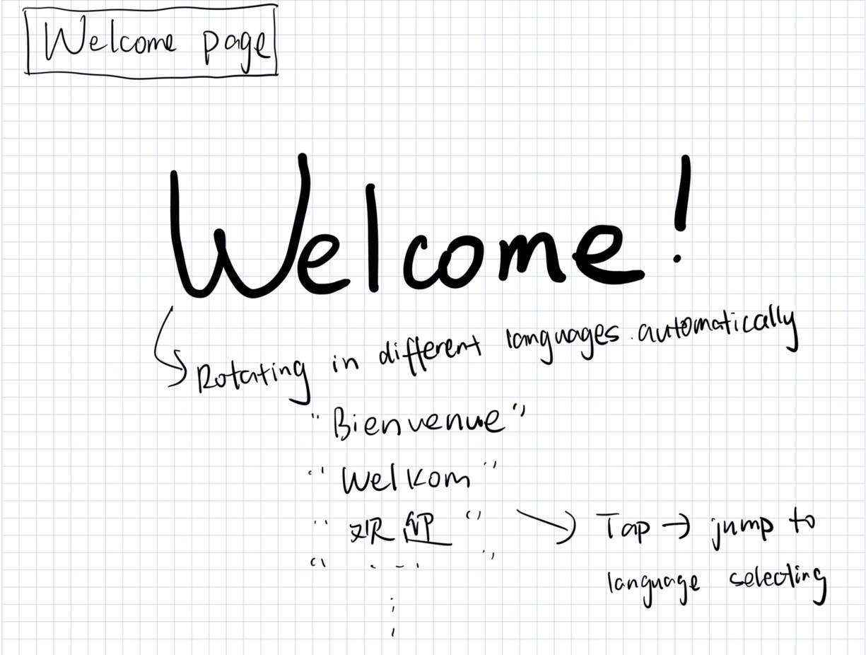
2. Welcome page
Another idea I have for the language support is to add a welcoming page. This is inspired by Apple. Every time a new user is setting up the new iPhone, a welcome page will show up and let the user to select the language.
Food Ordering
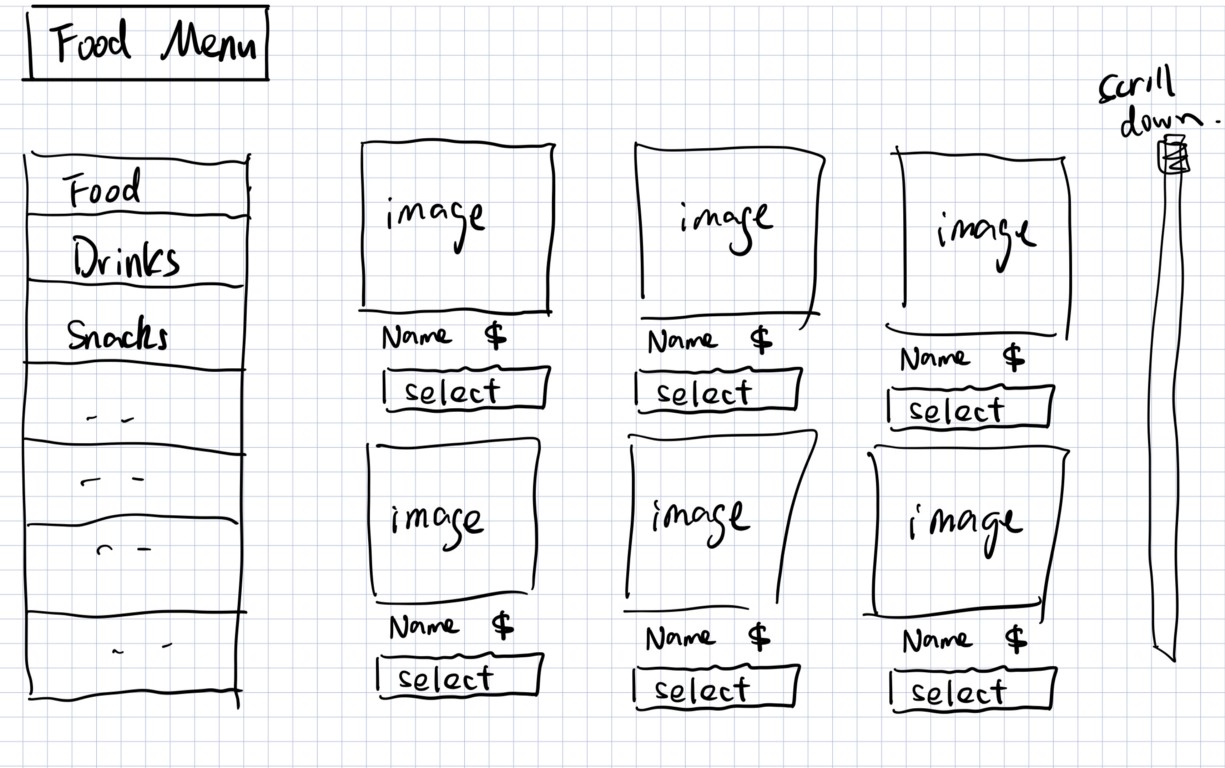
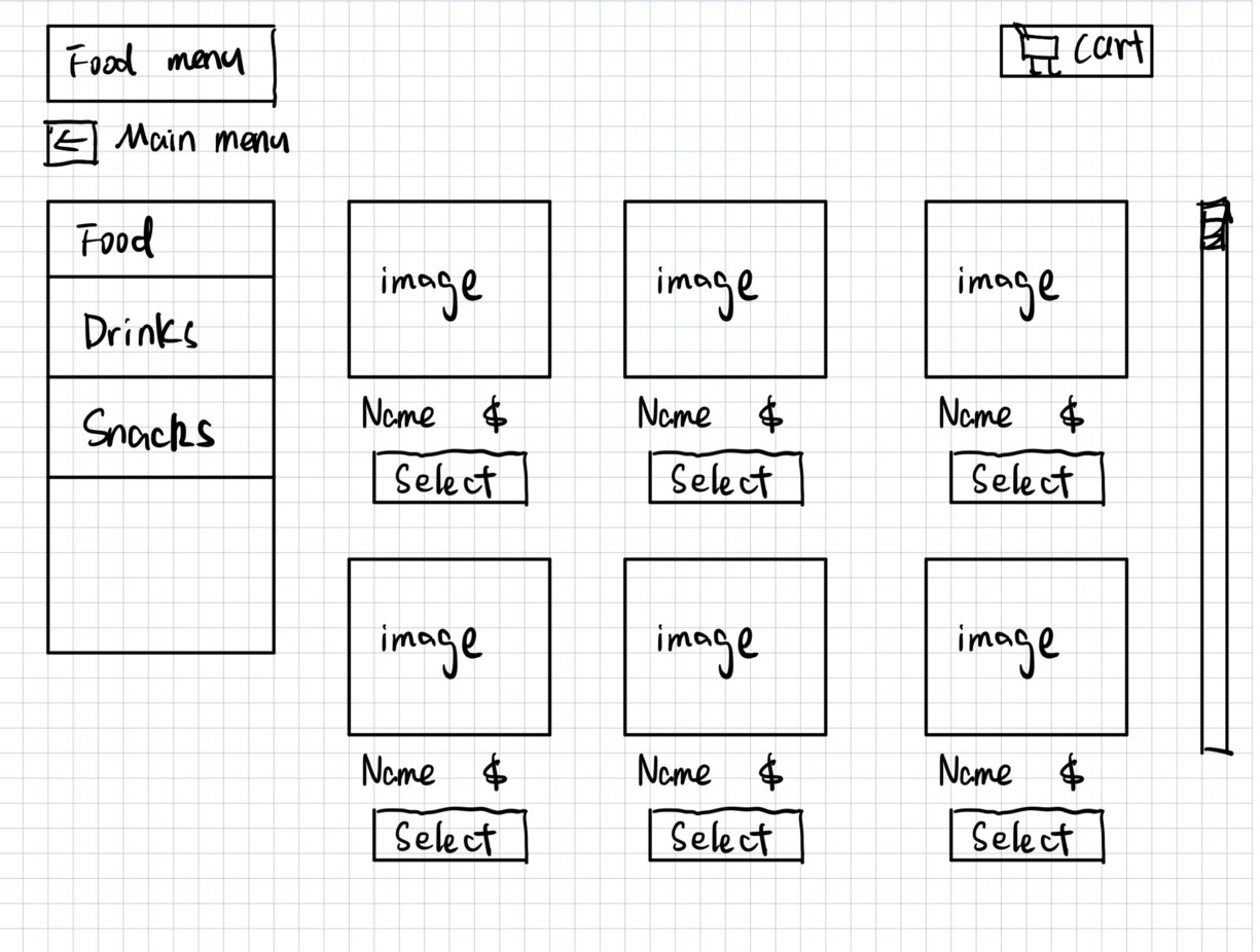
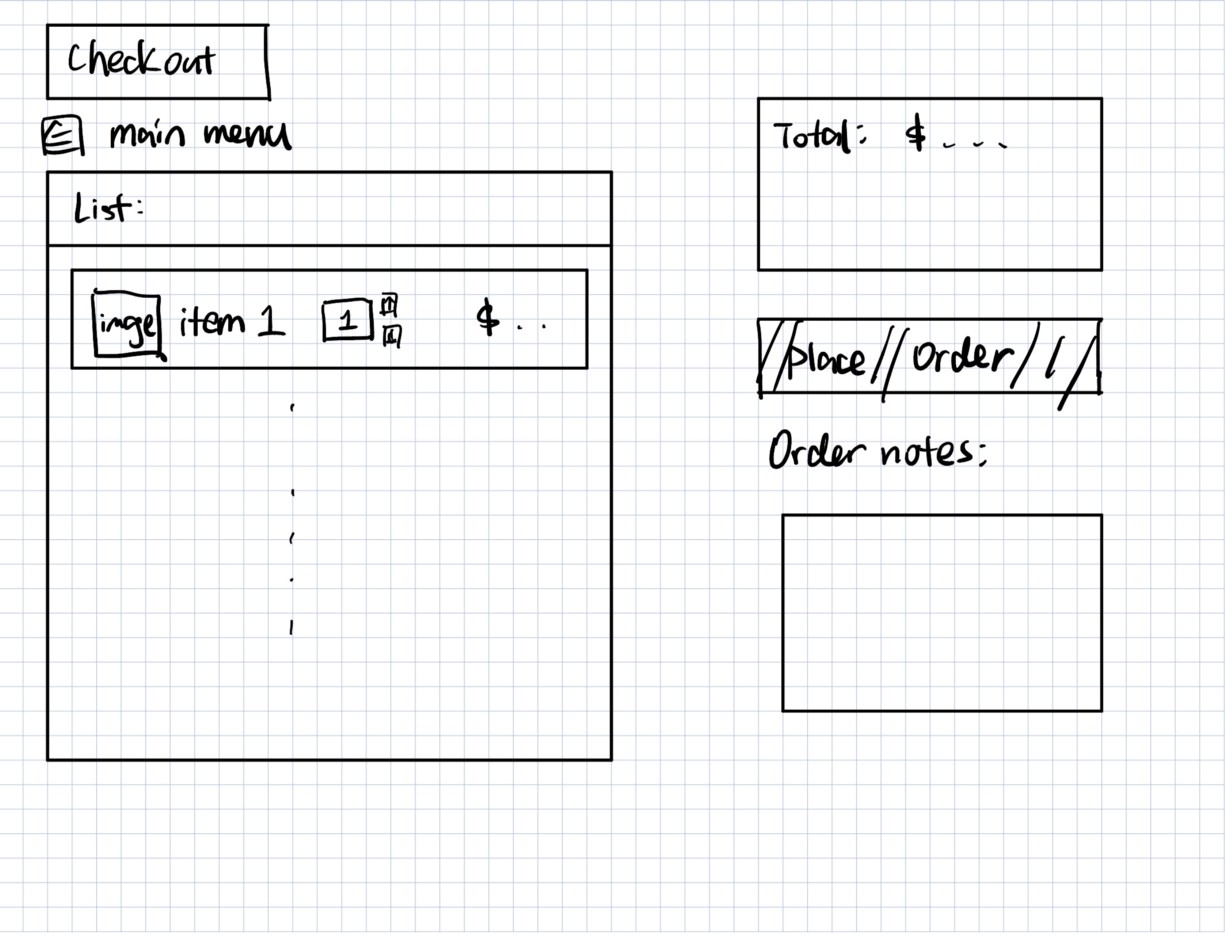
As for Food Ordering, the system should allow users to choose from various categories of food and place orders. Hence, there should be a Food Menu Page that users can browse different products, and a Shopping Cart/Checkout Page to finally place the order.

Paper Prototype
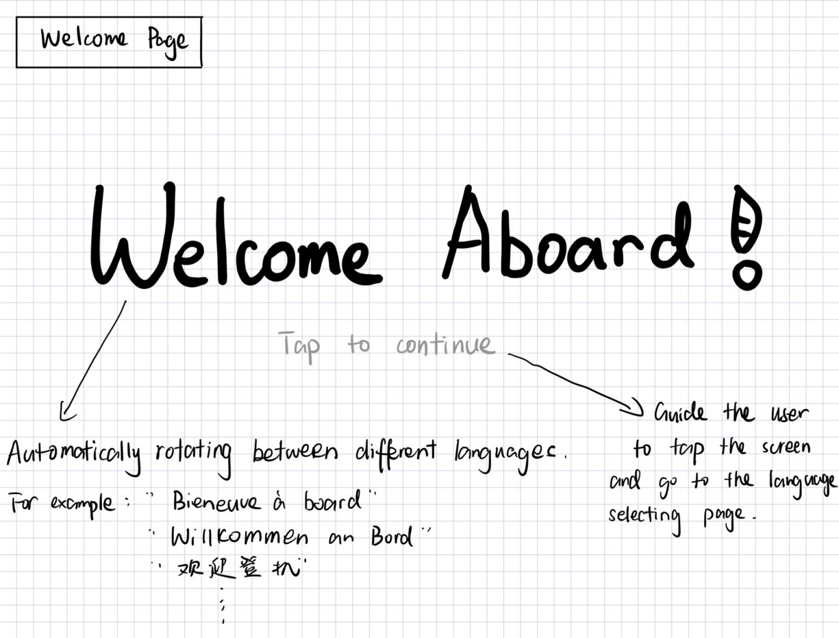
Language Support
As for language support function, I choose the second idea from sketching. The Welcome Page is the first page that users will see when they turn on the screen. And this page will automatically rotates ‘Welcome Aboard!’ in different languages. When users tap the screen, they will be directed to a more detailed Language Selecting Page .

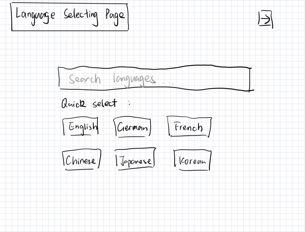
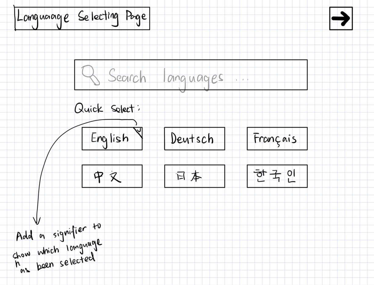
This Language Selecting Page enables the user to quickly select the most frequently used languages such as English, German, French and etc. Or users can search what language they prefer in the search bar. Once the user select the language they prefer, they can click the forward icon on the top right corner to go to the home page.

Food Ordering
Improvements based on the Feedback
In order to get feedback on the prototype created in the previous step, I tested it with few classmates and organized their feedback.
For the language support design, the feedback shows that some people are confused about what to do next when they see the Welcome Page. Hence, I added a ‘Tap to continue’ below the ‘Welcome Aboard!’ so that the user will know they need to tap the screen to go to the next page.
As for the Language Selecting Page, I changed two things. First, I add an icon on the top right corner of the Quick Select box, indicating which language the user has choose. In this way, users can get feedback after they made the decision. Also, I converted the text for each language from English to the language itself, making it more intuitive for users to select.
Food Ordering

Evaluation Plan
Assuming we have the time and resources we need, I will conduct an evaluation plan for the design in the following steps.
For each target user, I will let them try to use the product without giving any instructions. And after they use it, I will ask them to finish a questionnaire, rating the design on a scale of 1 to 5 stars in terms of following questions:
- Does the design achieve its goal?
- Is it easy to understand the message on the screen?
- How do you think of the design aesthetically?
- How difficult is it to learn to operate the system?
- Is the prompts for operation clear?
Apart from these rating questions, I will also ask users to give brief answer to questions like:
- What do you find best/worst about the Language Support design?
- What do you find best/worst about the Food Ordering design?
- Are there any comments/suggestions that can help us further improve the interface?
After collecting all the data of the questionnaire, I will visualize the data using charts or diagrams to evaluate the overall ratings for the design. And I will analyze the answers provided by the users to conclude possible aspects for future improvement.